
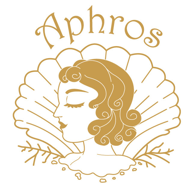
According to ancient Greek myth, Aphrodite, the goddess of love and beauty, was formed from the sea foam (aphros in Greek). Aphrodite captivated many with her beauty and charisma, both in the mortal realm and on Mt. Olympus, and to this day remains an important symbol of beauty.
Aphros wants to capture the essence of Aphrodite in every product produced. It's foaming cleanser calls back to Aphrodite's creation, and in doing so, emphasizes that anyone can let out their inner goddess.
Aphros Logo, Typography, and Brand Colors.
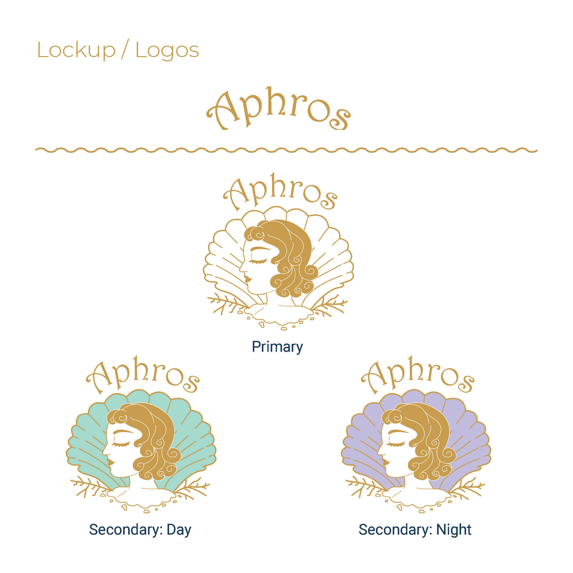
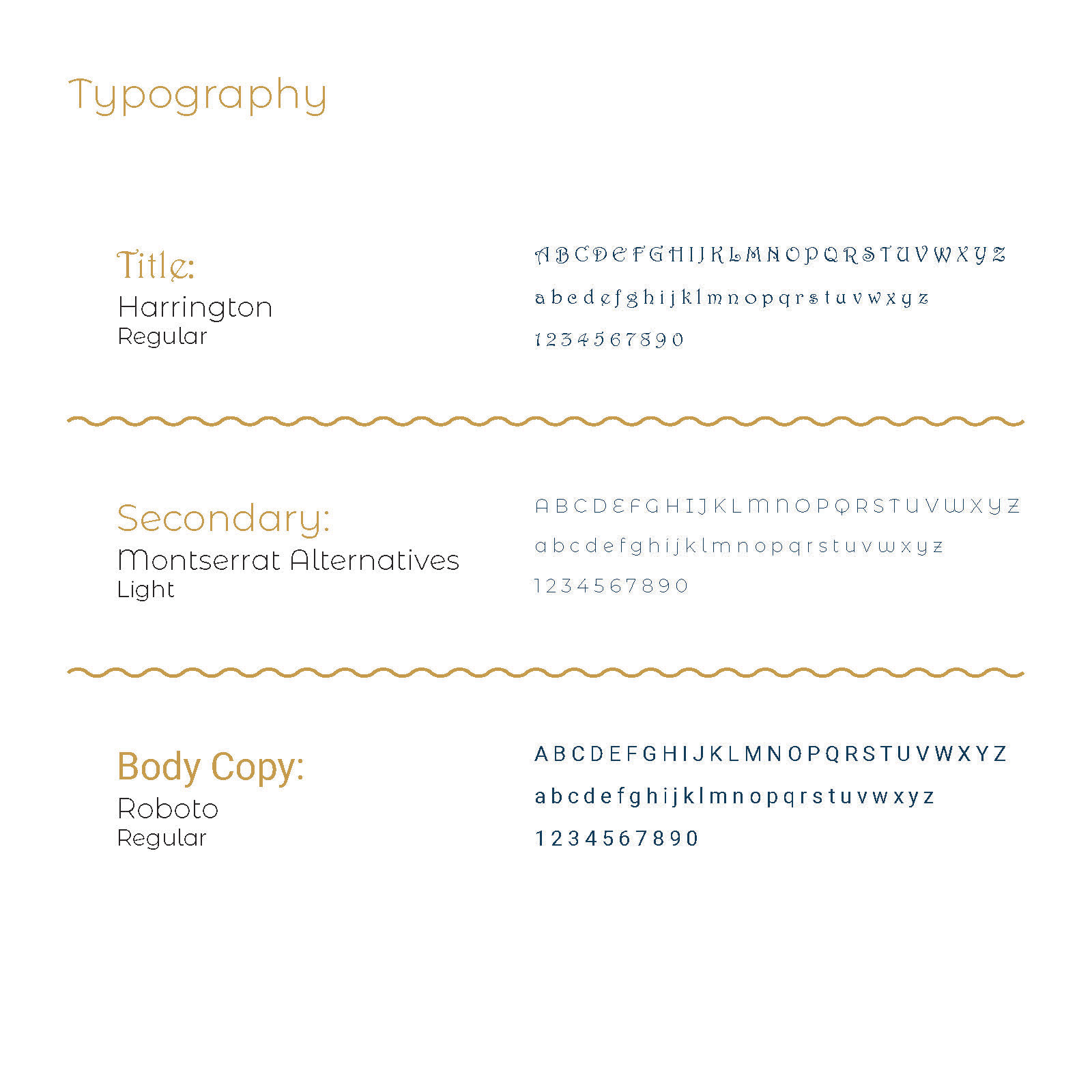
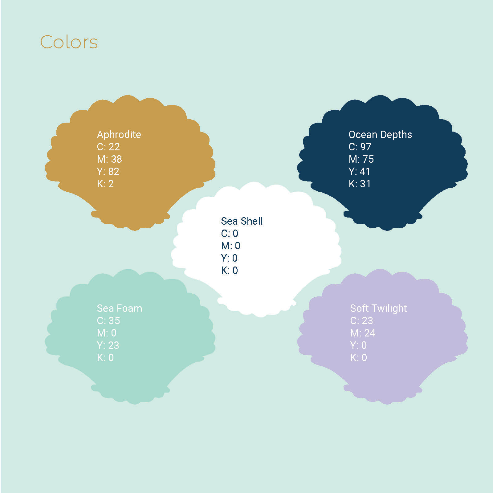
View the full style guide here.
Final Package Designs

Aphros Cleanser
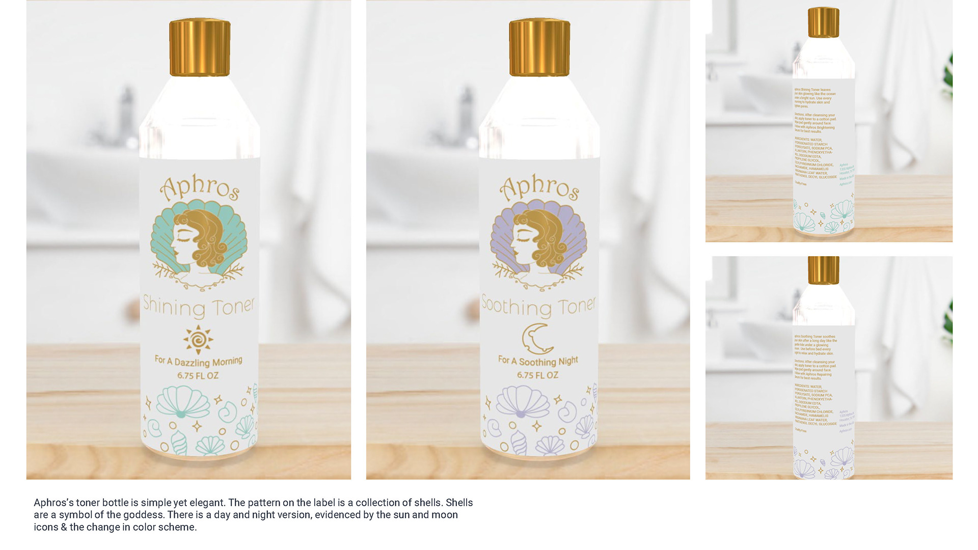
Aphros Toner
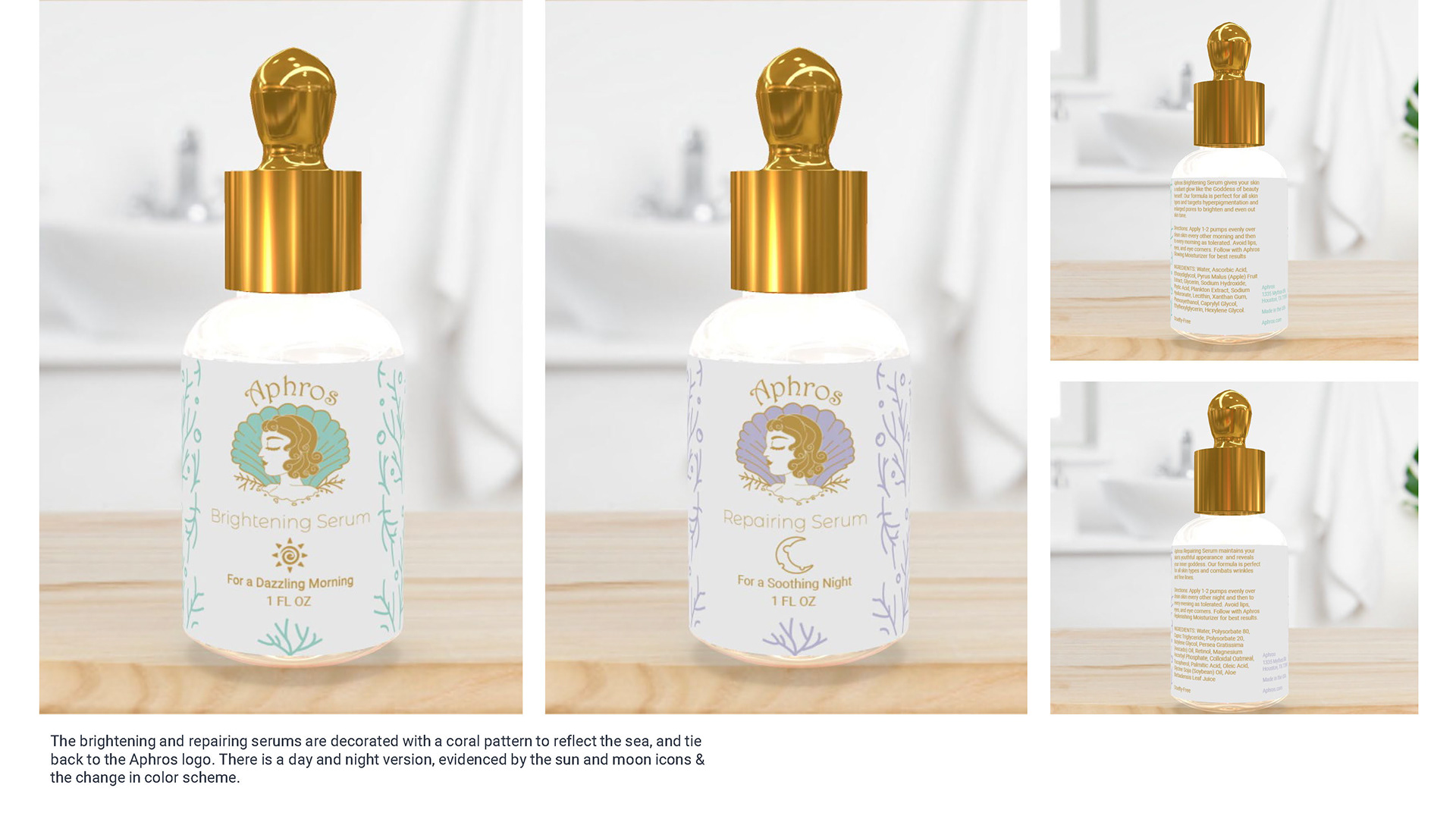
Aphros Serum

Aphros Serum Box
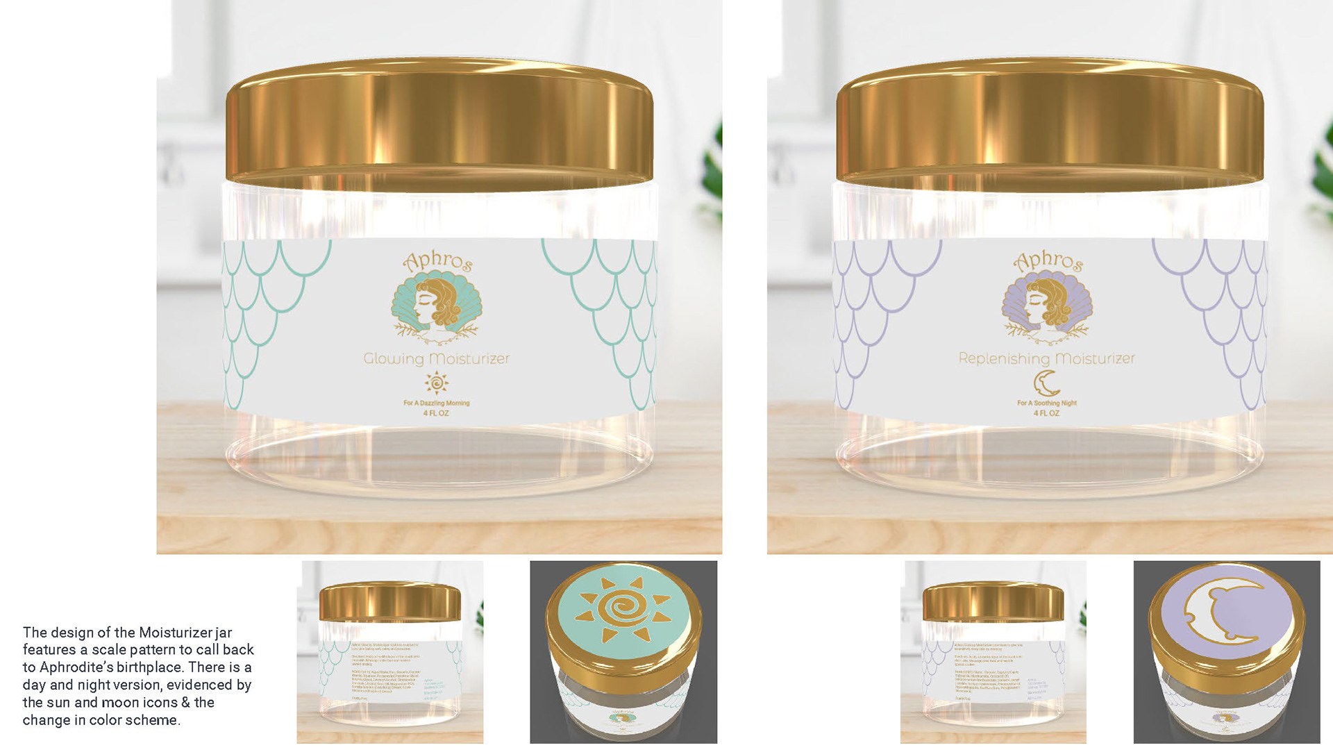
Aphros Moisturizer
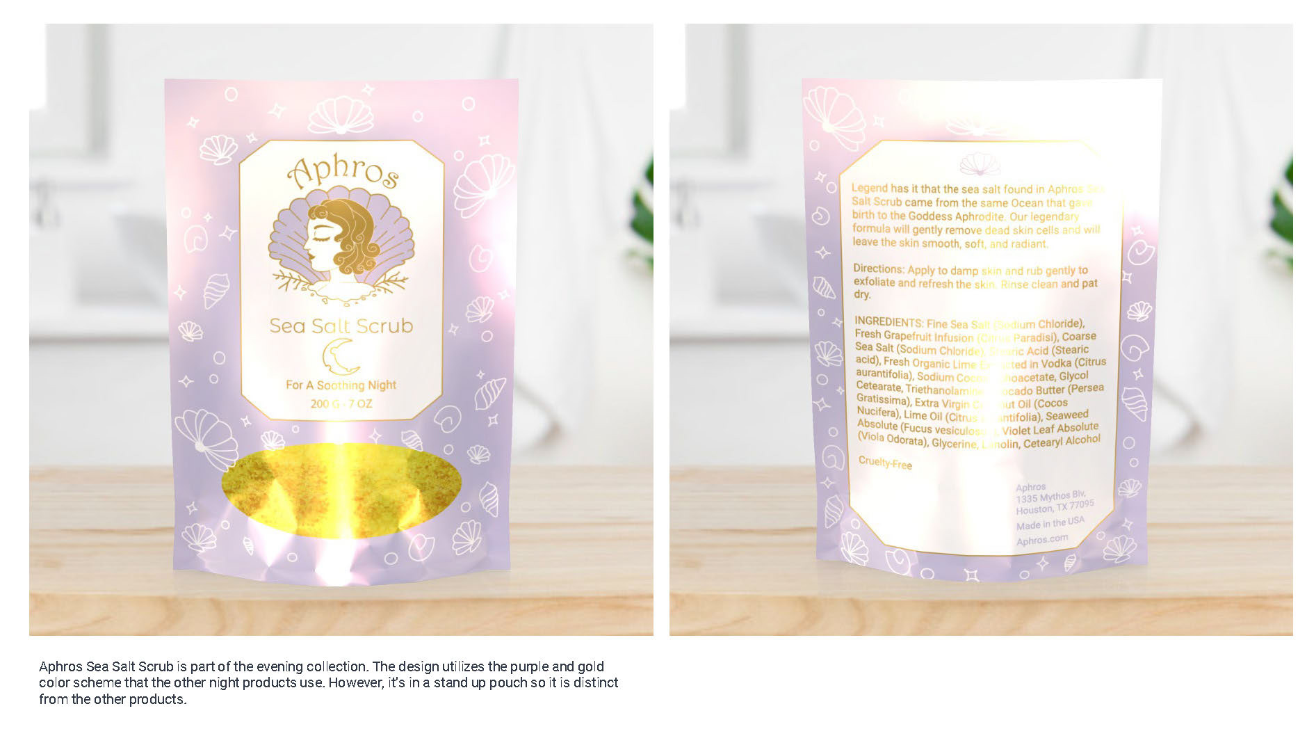
Aphros Sea Salt Scrub
Final design concepts for the skincare brand Aphros. The brand has 2 separate lines: an AM line that can be identified by the teal packaging and teal version of the brand's logo, and a PM line that can be identified by the lavender packaging and the lavender version of the brand's logo.
The creation of Aphros was a 6 week long project that was broken down into five phases.
1. Brand Research and Analysis: In this phase, I took an existing skincare brand and did a full brand analysis. The brand I chose to analyze is Thayers.
2. Brand Strategy: During this phase, I narrowed down the brand's target audience (upper-middle class to high-class women between the ages of 35 - 50) and created mood boards that inspired Aphros's look and style.
3. Final Brand Identity: The deliverable in the phase was a 10-page style guide that defined the brand's logo, typography, and brand colors. It also includes the initial packaging concepts for the day and night product lines.
4. Design Concepts: All package designs were developed here. The designs went through two rounds of critiques before I moved onto phase 5.
5. Final Design Concepts: The package designs were further developed and finalized during this phase. Furthermore, I created a presentation showcasing how the project progressed through all stages. The final presentation can be found here.