
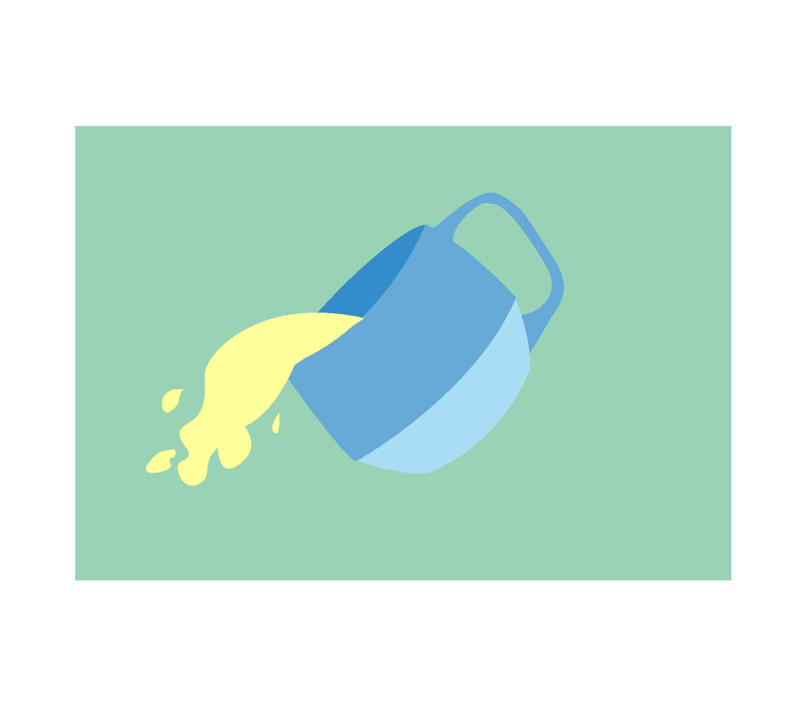
Pour Out Your Panic stems from the desire to create a tangible flag design out of an abstract concept. My flag represents relieving anxiety.
The logic: I kept the layout soft and minimalistic to reflect the theme of the flag. I didn't want to cause anxiety with a cluttered design. I used green as an accent color because green is known for its calming effects on the human eye.
The design: When you spill a drink, liquid flows out of its container. If the mug was too full, pouring out some of the liquid makes room for you to fill it again. Anxiety is very much like a liquid, it can fill your entire mind without leaving space for rational thought. Furthermore, relieving your anxiety is a bit like pouring out liquid from a mug that's about to overflow - doing so allows you to make space for more important things.
The blue mug represents a person, and the yellow drink represents their anxiety. Blue is a color that is associated with peace and comfort. Relieving yourself from your worries allows enables you to relax. Therefore, when the yellow liquid expels from the blue mug, it showcases the person actively becoming calmer. While you may wonder why I would choose a color typically associated with happiness, yellow does have negative connotations, anxiety being one of them. Finally, green is thought to be the most pleasing color for the human eye to look at. It also represents safety. The green background symbolizes a safe space, as people usually relieve anxiety in a comfortable place.